Monthly Archives: October 2017
The heritage of Jack Trice and Johnny Orr
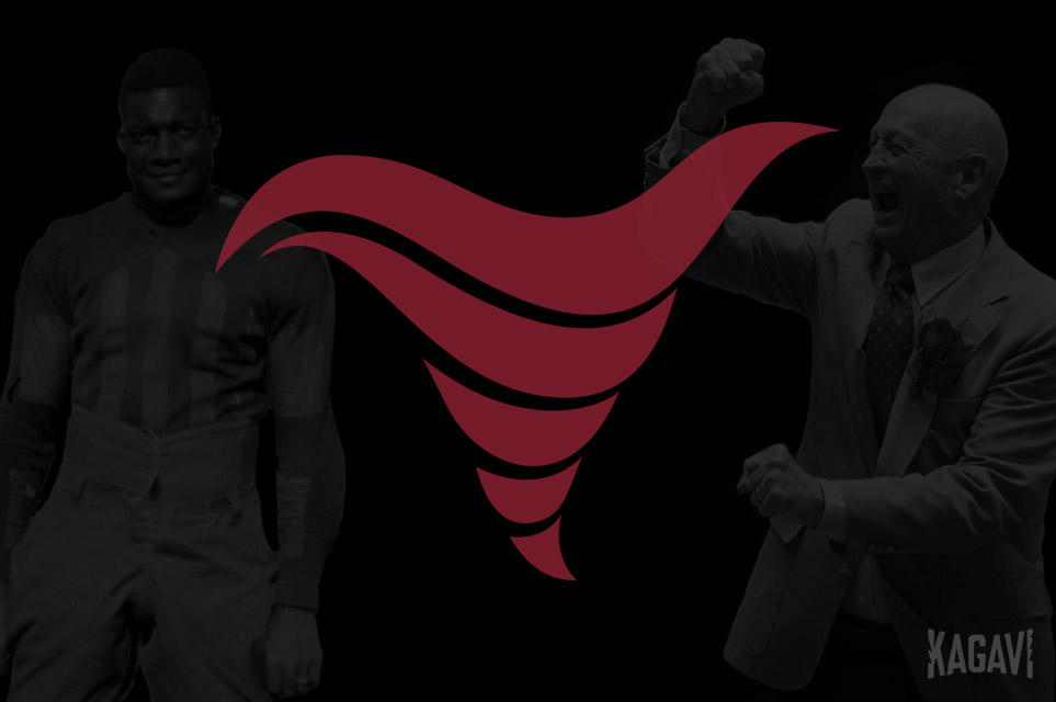
Two football seasons from now marks the 125th anniversary of the very first hardscrabble Ames football team to be bestowed with the Cyclones nickname, one that is older than the Iowa State moniker. As the oldest surviving varsity sport on campus, the football team drives the overall identity of athletics, as shown by the new Cyclone logo reveal during the Texas game last week.
The heritage of Iowa State University stretches back from generation to generation over American history, to a time before the Civil War. The trials and tribulations of the athletic teams serve as shorthand in our memories, the nectar of success sweetened by the lows, yet something tangible with the current identity appears missing.
The answer lies within two statues.
_____________
In Hilton Coliseum stands a fist pump frozen in time, a statue commemorating the true birth of basketball greatness with Johnny Orr. The original Cyclone school logo from this period, in use for roughly a dozen years, famously oversaw nearly all of Johnny Orr’s years as the progenitor of Hilton Magic, culminating with Fred Hoiberg’s initial stint as the Mayor of Ames.
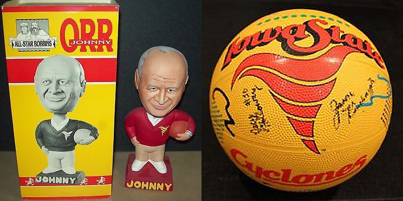
It also served as the helmet logo for four football seasons from 1983 to 1986, a period that saw typical football and a minor recruiting scandal that resulted in a temporary loss of just four scholarships.
As seen in previous stories, the updated Orr Cyclone by professional designer and alumnus Friendan.Design is the closest thing Iowa State has ever had to a timeless look and lends well to fresh, yet timeless branding possibilities, including my Storm Cyclones football helmet concept that caught the attention of many, including those within the football program.
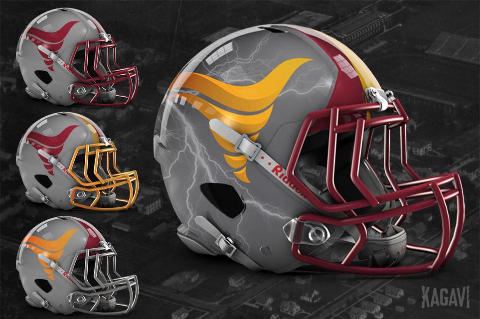
When Coach Matt Campbell arrived in Ames, he quickly made clear his desire to shake up some dowdy brand elements, by pushing concepts including the return of a Cyclone logo that some within the school felt was already sufficiently covered by the unpopular Cy Head logo, despite being just about the only major school without a nickname logo, (as pointed out last year).
The reveal during the Texas game represents clear and tangible internal progress in loosening up branding and marketing possibilities, but did the new logo hit the target?
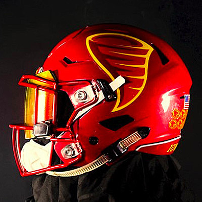
Designed by Joe Bosack & Co., a brand consulting agency previously tapped for the current mascot logos, this logo has a few immediate issues. (To be fair, every designer is only as good as their client and its impossible to say what constraints were placed upon the agency.) When considering a timeless design, it all starts with the line, a simple mark on a surface. Ancient art is replete with simple outlines and shapes that resonate to this day, easy for the human eye to recognize.
The primary logo has three colors, including two red shades for contrast that don’t read legibly, and relies on a very thin yellow border as the outline. All fans could see during the Texas game was a big red smear on a red helmet, the nuances of design lost. The edgy lines remind me of the dated mid-1990s Iowa State basketball shorts and the old oval ABC Sports logo.
On merchandise rolled out the same day, the design appeared best on white or gray backgrounds. If a primary logo needs to move away from school colors to read in a legible manner, that’s a problem. Also, a solid version of the mark appeared, but with the same reliance on very thin lines.
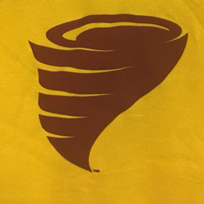
The I-State logo initially suffered from a reliance on excessive bevels for a contemporary look, but recent efforts have evolved towards a stencil or solid color design, which appears much more iconic and timeless. The new Cyclone just looks like an inverted Hershey Kiss.
Change is usually met with some resistance, but feedback this time has largely been negative. The official Iowa State Facebook account had hundreds of negative comments and only a handful of positive. In a Twitter poll, I put up a simple image of the new Cyclone and the updated Orr Cyclone and simply asked which one people preferred. Hundreds of votes later, 86% were in favor of the Orr Cyclone.
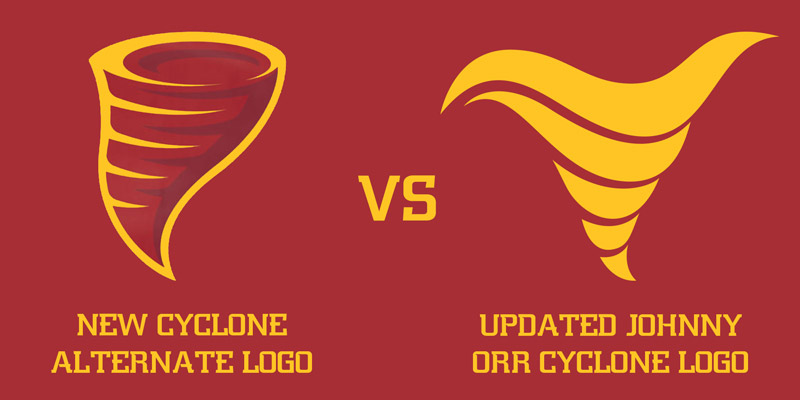
After some inquiries this past weekend, it appears many in the football program favored the Orr Cyclone redesign making an appearance on football helmets, but unfortunately had to adhere to the final decision of others who felt the new logo would be a better direction.
It seems pretty clear below which version appears more iconic and timeless.
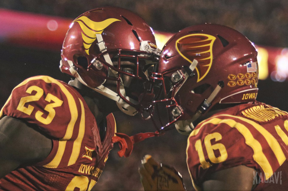
In the past, athletic director Jamie Pollard openly shared with alumni that the department felt the Orr Cyclone evoked memories of bad football teams with a small portion of the fan base and they had no desire to go through the travails of adding another secondary logo, thus giving the perception of Iowa State always changing their brand.
Do the facts support this? Let’s look at some numbers via Winsipedia:
Overall Iowa State winning % (1892-2017) = .442
Original Cyclone helmet logo winning % (1983-1986) = .409
Current I-State helmet logo winning % (2008-2017) = .336
It’s also worth noting the current I-State logo was inspired by a logo from the 1970s basketball uniforms, the exact same era that saw the worst basketball team in school history, the 1975-76 team that finished 3-24.
This makes the new Cyclone logo all the more puzzling. Hopefully, internal resistance to the updated Orr Cyclone will continue to melt away, given how much history is behind it when compared to the I-State logo. It remains the best option for Iowa State to properly honor its heritage and get off the endless spinning wheel of new secondary logo after new secondary logo with no real tradition behind them.
For now, this new Cyclone logo should serve as a retail mark, not quite making the leap to official nickname logo status, joining the many tornado variations seen on clothing and marketing materials. There is precedent for this as many football teams have used alternate logos on helmets that don’t become part of official school branding, but are found on merchandise.
Sometimes a design transcends time, just like a story familiar to many of you …
_____________
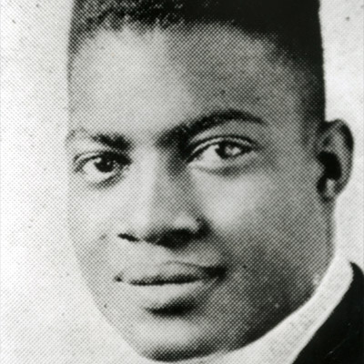
South of Hilton Coliseum stands the modest statue of a black pioneer, head bowed in contemplation of the letter that made him famous. Jack Trice’s story remains the most enduring and important piece of Iowa State history and transcends the bounds of sport, spilling over into what it means to be human. Many are rightfully proud of the football stadium being named after him, but the accompanying details seem lacking.
In the earliest days of Kagavi, before I became a crack Jack Trice historian, I asked Iowa State athletic department if they knew what his number was and no one could give me an answer. Along the way, I found people like author Steven Jones who suspected his number was 37 from newspaper accounts, but it was the discovery at Simpson College of perhaps the only surviving game program from Jack’s single full game at Iowa State that confirmed the case.
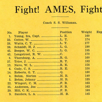
Since then, multiple people including influential former Iowa State professor and historian Tom Emmerson who was one of the first to highlight Jack’s legacy in 1957, have asked the athletic department for Jack’s number 37 to be retired or honored. In a recent book, “Moments of Impact” by Jaime Schultz, she wrote that Pollard declined these requests to honor Jack further by noting how many parts of the stadium were named after him, essentially enough was enough.
In April 2016, I wrote a story asking Iowa State to elect Jack to the Athletics Hall of Fame, noting that they have honored people who didn’t even attend or play sports for Iowa State, so they certainly could find room for the pioneer of racial integration in sports, a player that may have been the finest to ever step on the field in Ames. This has not occurred yet.
This summer when I was reviewing the new football media guide, I saw a new section of compiled historical jersey numbers worn by players. For some odd reason, this ended with the year 1924, meaning that the last entry of players who wore number 37 was Tawzer in 1924. Surely there was space for just one more line in the guide to slide in an acknowledgement of Jack’s number, which still hasn’t formally been acknowledged in any way?
As Coach Matt Campbell continually preaches, the details matter.
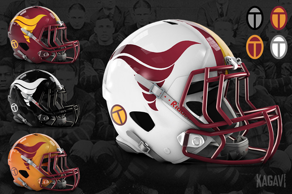
By simply halting Jack’s honors with just the stadium name, Iowa State is willingly giving up the ability to take his story on the road for half of the football season. Many other teams use helmet stickers or patches to commemorate significant parts of their heritage. Look no further than Iowa and their ANF stickers, in use for decades, for how impactful a simple sticker can be. When reviewing ideas, I couldn’t stop looking at various East Tech scarab designs from Jack’s time there and two caught my eye, eventually leading to my new design of a proposed Trice Oval memorial sticker.
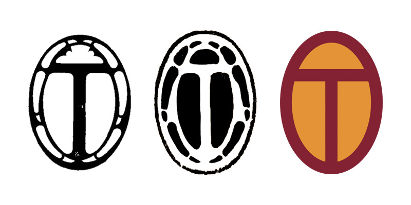
This proposed design recalls the shared gold color between East Tech and Iowa State, the triumphs of Cleveland and the sacrifice in Ames. The stylized block T evokes vintage Iowa State logos and the ancient scarab also represents rebirth, perfectly appropriate for this enduring tale.
Don’t stop with Jack Trice either.
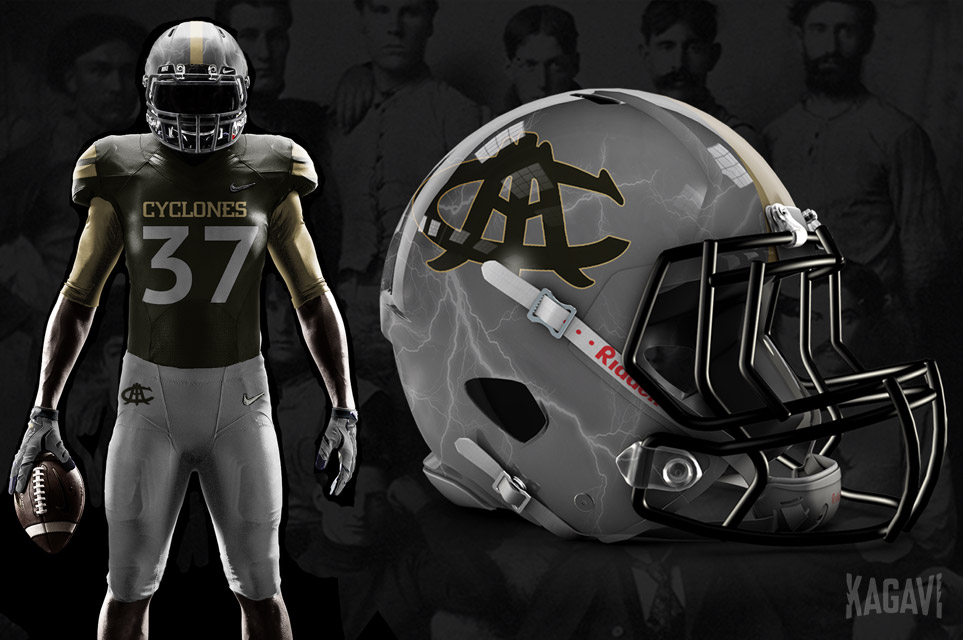
More throwbacks and vintage logos should be introduced into the rotation and help strengthen the connections between the past and present. Let’s solidify the heritage connection of Storm Gray as a neutral color in the current branding package by taking one game to honor the original Cyclones team of 1895 and their school colors of silver, gold, and black. The helmets and uniforms could be auctioned off afterwards.
_____________
To some, Iowa State may represent just a job or a way to pay the bills, but to thousands of alumni, it’s far more. By properly honoring two iconic figures in Cyclone sports history through design, Iowa State University can take a strong step forward, with a clear and cohesive timeless brand that advertises the Cyclone difference to the world.
Heritage matters.
